This page automatically redirects to Original Type. If you're not redirected, please follow this link .
Hello! Let me show you my typefaces. Or perhaps you might need something tailored to your needs? You can commission me to design your custom type.

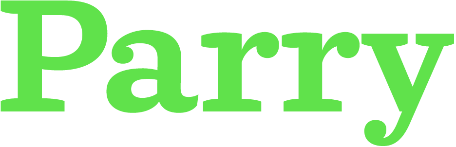
Parry overview styles
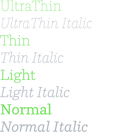
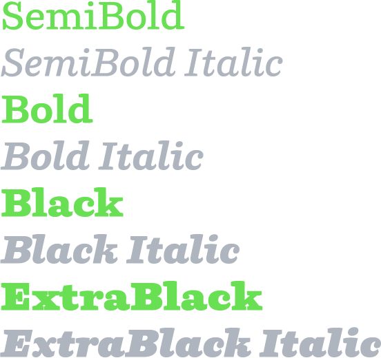
Parry specimen
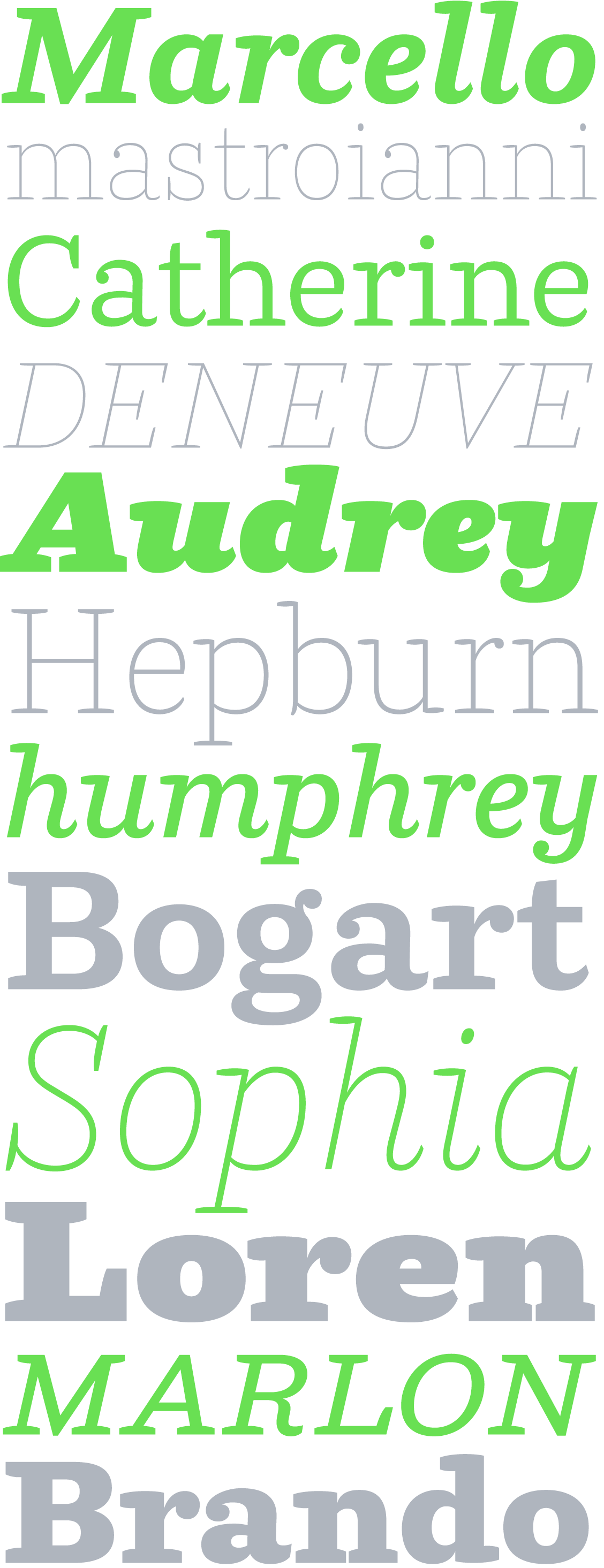
Parry basic characters
Parry fontinfo
Parry has it roots in the sturdy slabserifs common to the Victorian age, but despite its nineteenth-century perfume, it is unmistakingly a contemporary typeface. It produces a much rounder and softer image than the often rigid slab serifs of those times.
Since its release Parry has proven to be a more than versatile typeface. It is a comfortable and reliable choice for a wide range of applications: from corporate identities to subtile book typography, from magazines to billboard-sized advertising campaigns.
Parry consists of roman and italic designs in eight weights: Ultra Thin, Thin, Light, Normal, SemiBold, Bold, Black and Extra Black.
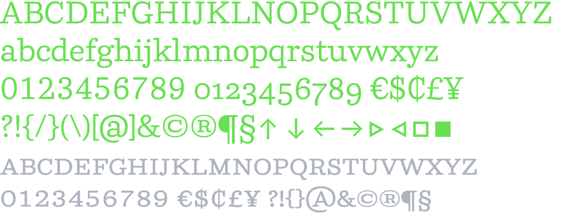
The standard character set (STD) includes small caps, while the pro set (PRO) adds lining, old style and small cap figures (each in tabular and proportional widths); fractions; comprehensive scientific superiors and inferiors, nominators and denominators; case sensitive punctuation sets; mathematical and monetary symbols (in tabular and proportional widths); arrows; standard and discretionary ligatures; and a complete range of accents for all Latin-script-based Western, Central and East European languages.
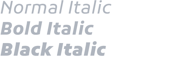
Parry Grotesque overview styles
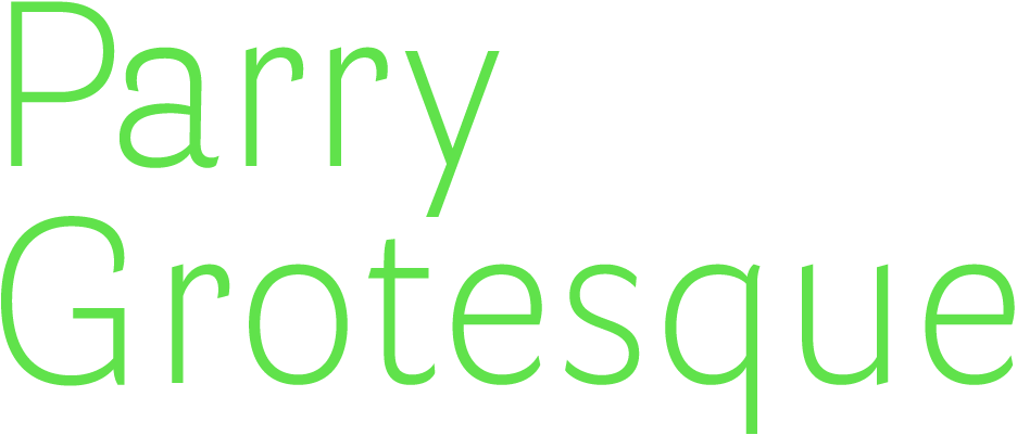
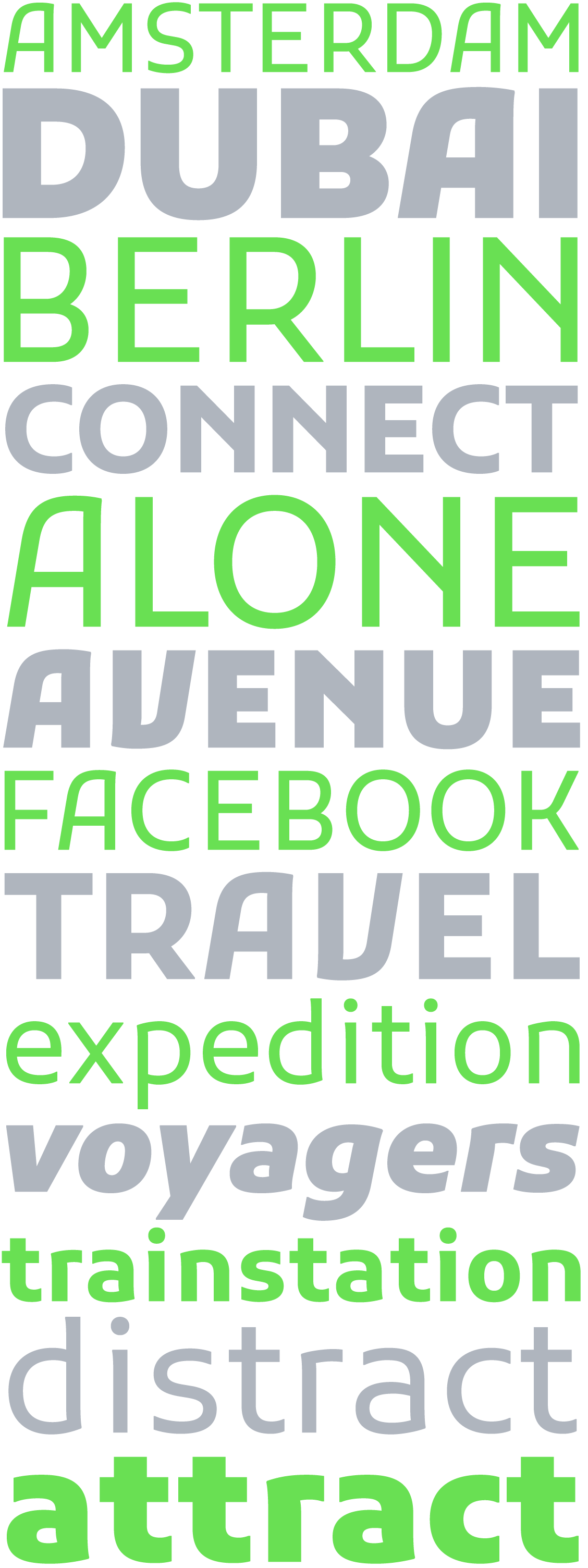
Parry Grotesque specimen
Parry Grotesque basic characters
Parry Grotesque fontinfo
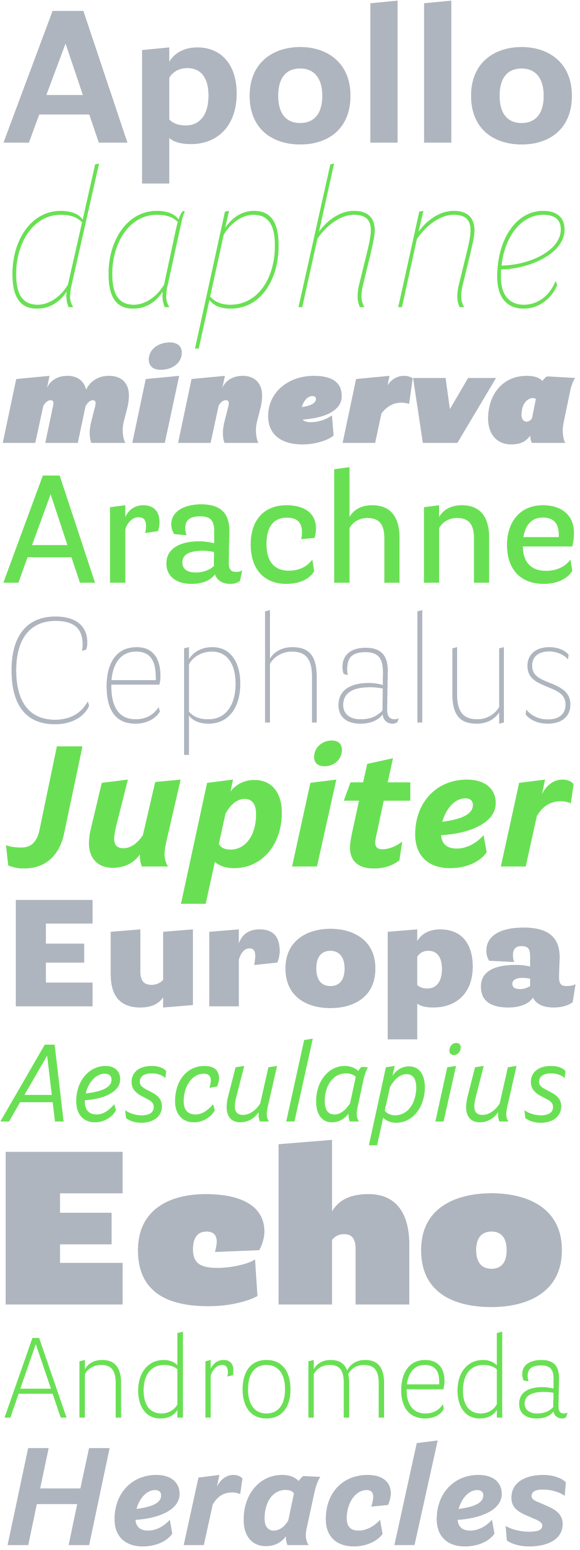
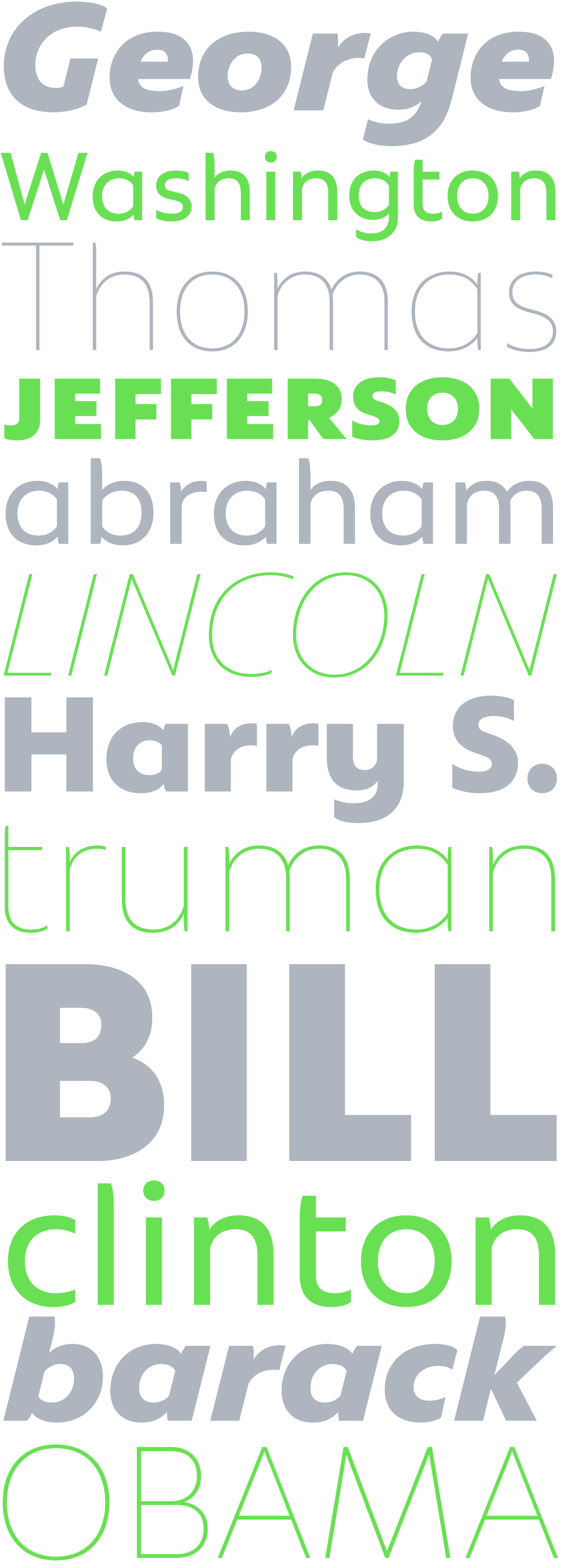
Parry Grotesque is the sanserif counterpart of Parry. Just as Parry has it’s roots in the nineteenth-century slabserifs, Parry Grotesque is inspired by the sturdy sanserif faces that were seen in nineteenth-century printed matter.
Since early nineteenth-century slabserifs and grotesques have been created and produced as separate designs, but, with a fair amount of typographic skills, they often complemented one another better than many contemporary humanistic sanserifs, created to match their serifed counterpart.
Looking at the contemporary designs that address this historical model, Parry and Parry Grotesque are undoubtedly the first to bring a slabserif and grotesque variant under the same proportions, weight and glyph characteristics.
Since its release Parry Grotesque has proven to be a more than versatile typeface. It is a comfortable and reliable choice for a wide range of applications: from corporate identities to subtile book typography, from magazines to billboard-sized advertising campaigns.
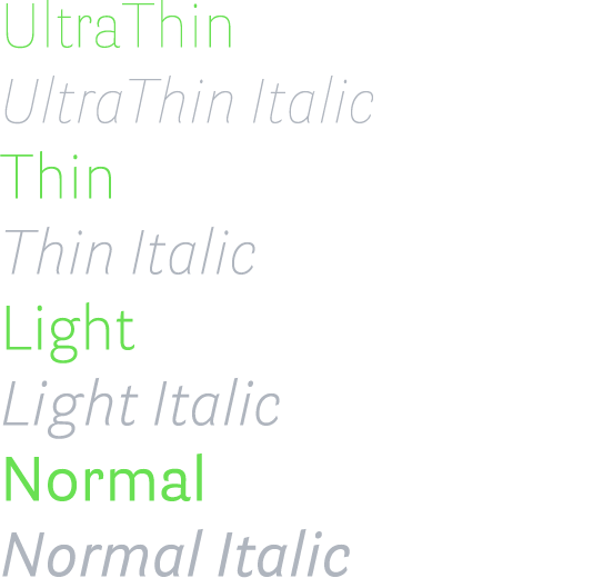
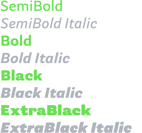
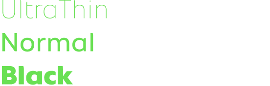
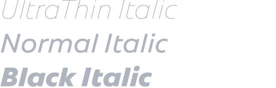
Parry Grotesque consists of roman and italic designs in eight weights: Ultra Thin, Thin, Light, Normal, SemiBold, Bold, Black and Extra Black.
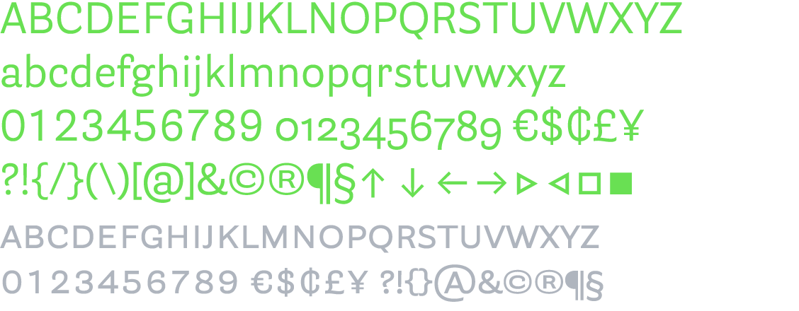
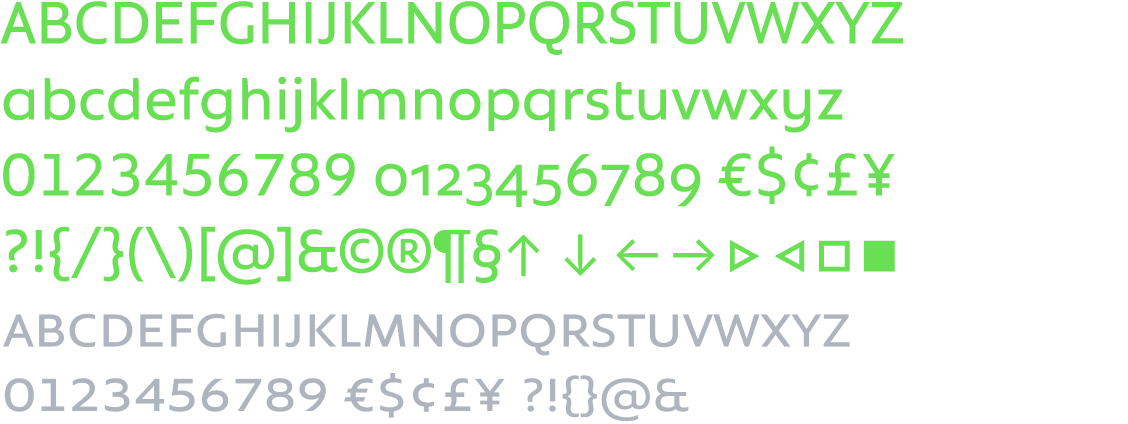
The standard character set (STD) includes small caps, while the pro set (PRO) adds lining, old style and small cap figures (each in tabular and proportional widths); fractions; comprehensive scientific superiors and inferiors, nominators and denominators; case sensitive punctuation sets; mathematical and monetary symbols (in tabular and proportional widths); arrows; standard and discretionary ligatures; and a complete range of accents for all Latin-script-based Western, Central and East European languages.
Kufam overview styles
Kufam specimen
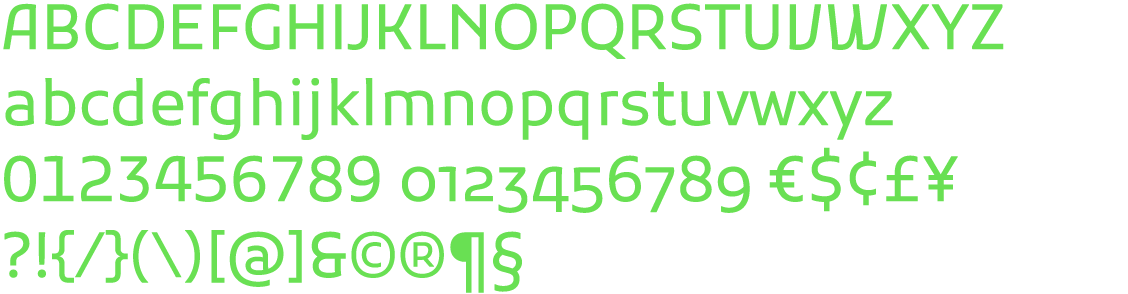
Kufam basic characters
Kufam fontinfo
Kufam is the result of the collaboration between me and my design partner Wael Morcos in the second edition of the Typographic Matchmaking project in which we set out to design a typeface containing both Arab and Latin scripts that would complement eachother.
The typeface finds it’s inspiration in sources far apart from each other in both time and distance: the arabic Kufi script in the lowercase and dutch urban lettering seen in the twenties and thirties of the previous century in the capitals of the Latin.
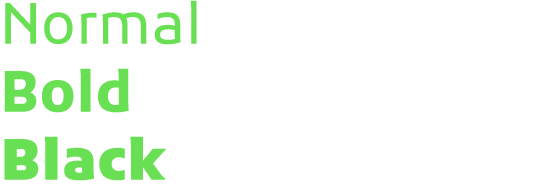
Kufam is perfect for display use, but also works very well in text size. It’s open counters and generous spacing and clean, sturdy shapes add potential for high on-screen legibility. The typeface works well in different environments, but is specifically suited for information design and publications with an contemporary feel. The design comes in three cuts: Regular, Bold and Black.
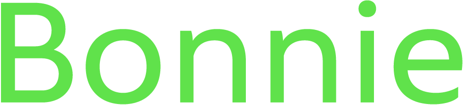
Bonnie overview styles
Bonnie specimen
Bonnie basic characters
Bonnie fontinfo
Bonnie is born out of the need for having a sans serif with the bold qualities of geometric sans serif designs such as Futura, but at the same time having enough amicable qualities that make a pleasant when used for setting longer texts.
Although legibility is not the first quality one associates with the geometric genre, Bonnie's large x-height and open construction make it surprisingly legible in small sizes in both screen and print medium.
Bonnie will find it's way particularly well in editorial environments such as magazines and publications, feeling confident enough to act in a leading role, and humble enough to support another star.
Bonnie will come in three widths and eight weights, in OpenType STD and PRO character set.

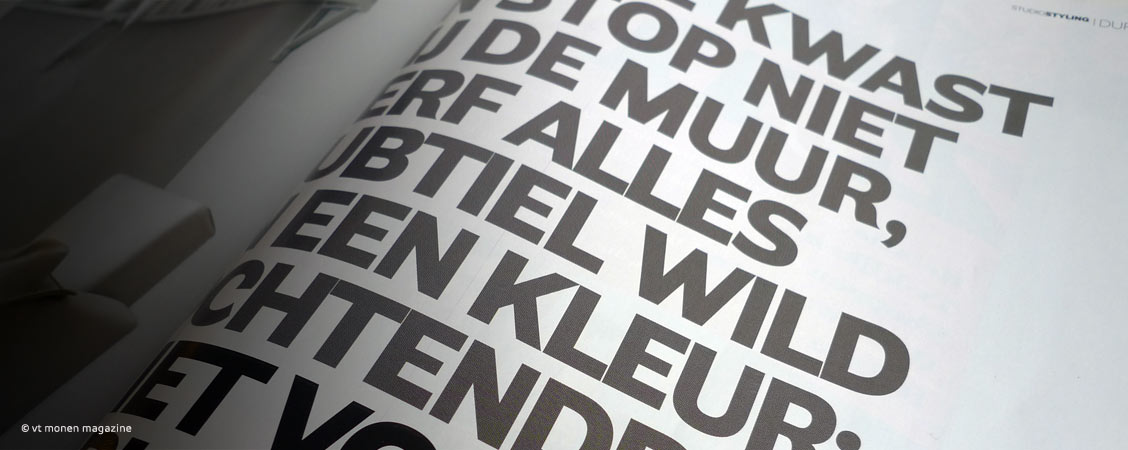
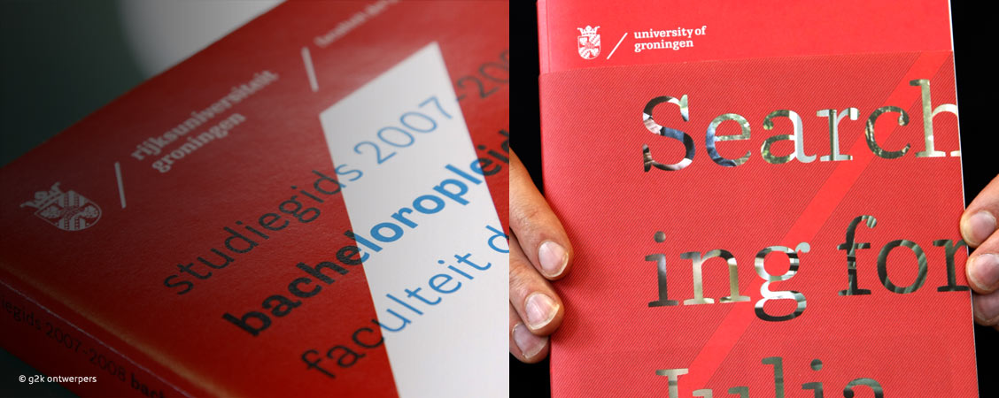
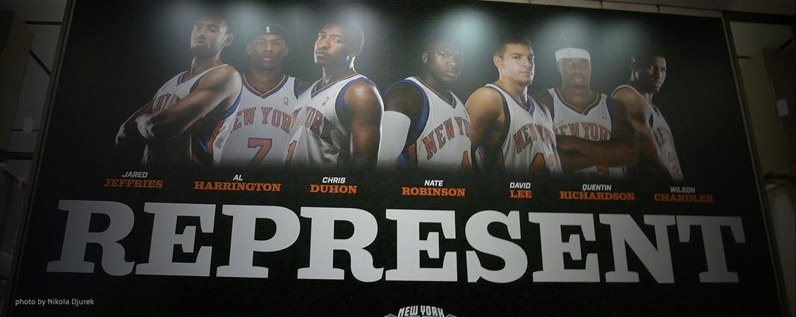
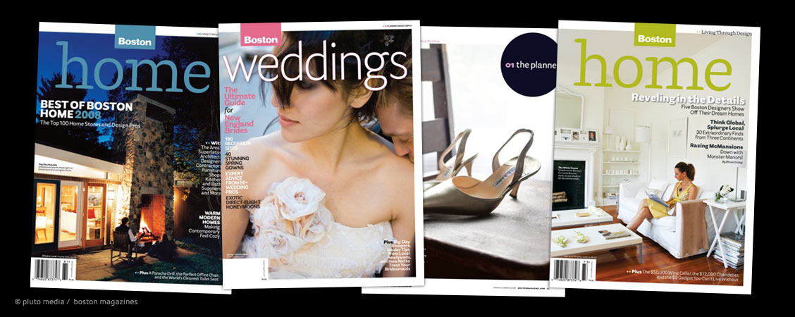
I'm proud to have VT Wonen magazine, Rijksuniversiteit Groningen, New York Knicks, House Beautiful, Boston Home, UIT in Noord-Holland, Alliander and many others among the users of my fonts.
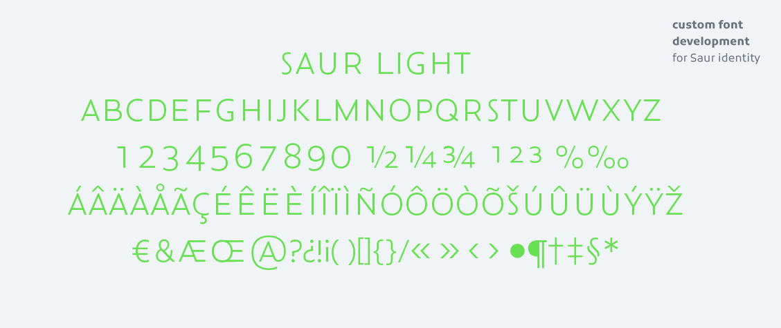
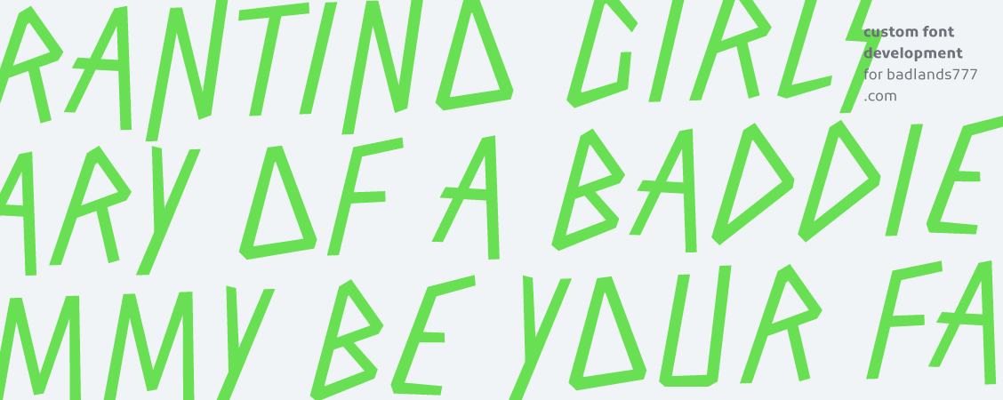
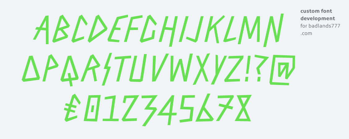
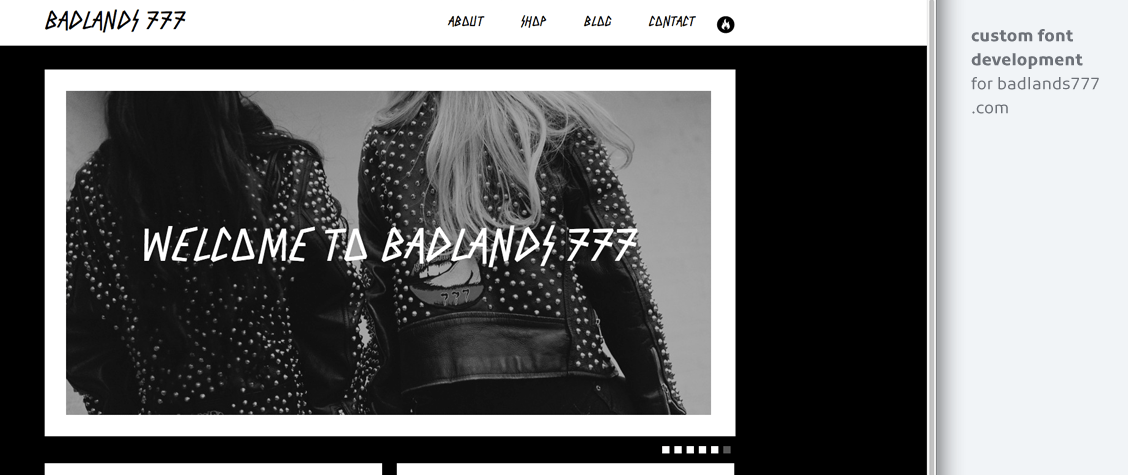
Custom fonts
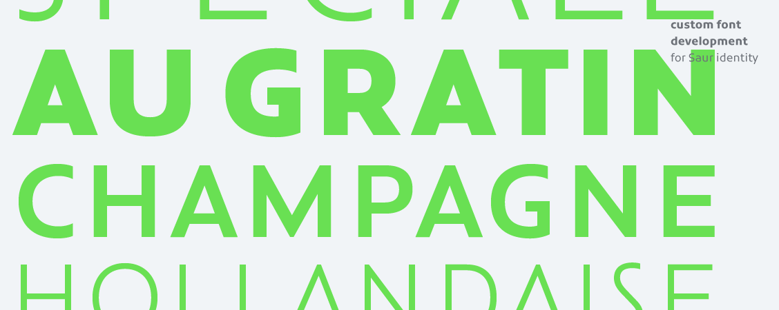
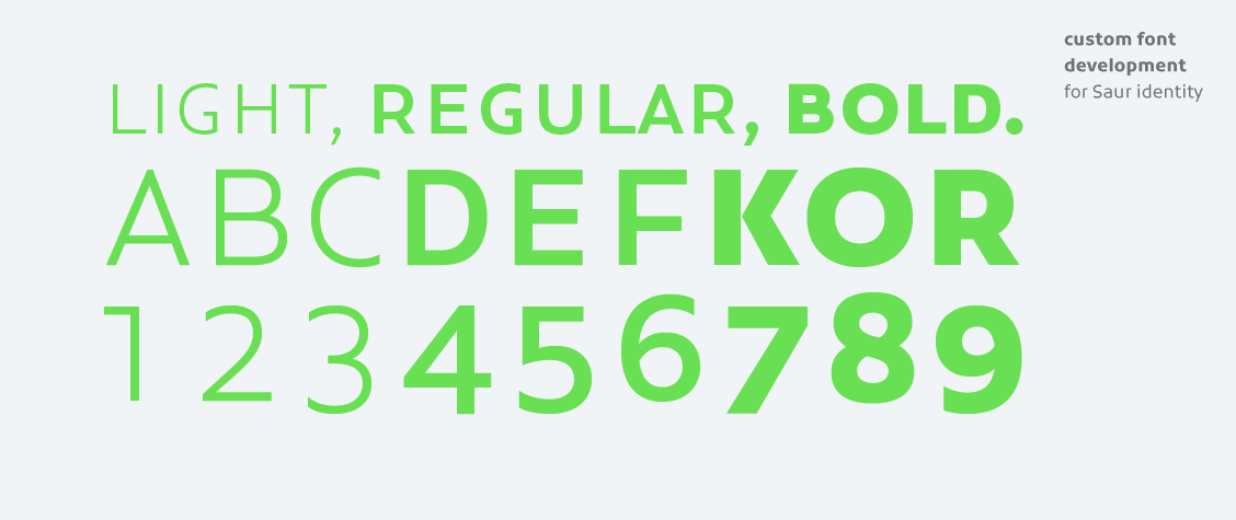
Nowadays there’s an incredible amount of fonts available, but companies and brands are increasingly recognizing the benefits of custom fonts that are tailored to their needs. On a emotional level custom fonts can enhance the perception of your identity, while on a practical level custom fonts solve issues such as screen display performance, language coverage or any other technical issue.
Who benefits from custom fonts?
Custom fonts are typically ordered by advertising agencies or design studios for brand and corporate identities, by magazines and newspapers in the process a redesign, by product and software developers that need fontsupport and by packaging designers that need unique lettering to enhance their designs.
But how much does a custom font cost?
Pricing of custom fonts depends on a variety of factors: the size of the characterset, the number of weights, an exclusive or non-exclusive license, optimized screenperformance, to name a few. Surely a custom fontfamily with numerous weights and styles and a large multilanguage characterset requires a substantial budget. But… a single font consisting of only capitals for use in your magazines’ headlines might just be a lot less expensive then you would expect. There is a solution for every budget.
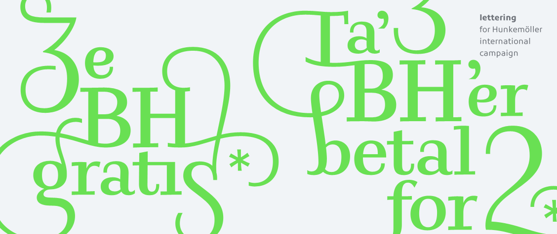
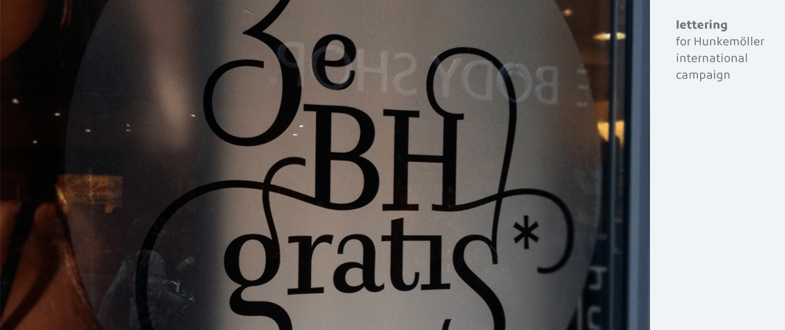
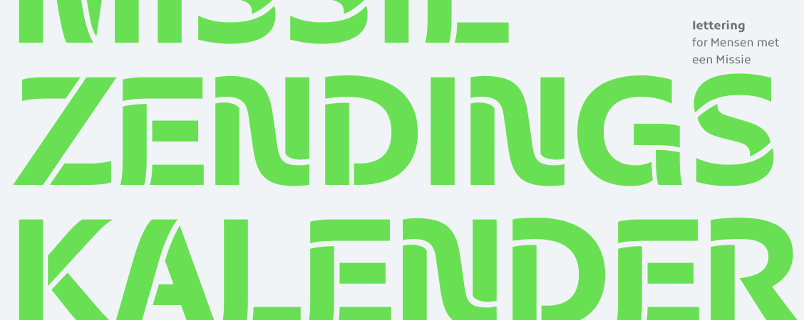
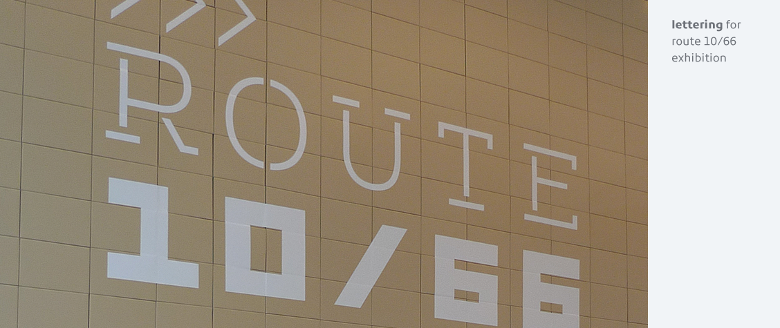
Lettering and logo treatment
For those projects where a complete fontfamily with full characterset is not needed, but there is need for a unique typographic voice, Lettering is a great solution. Lettering is specifically beneficial to packaging and product design, magazine and newspaper mastheads and headers and pay-offs for advertising campaigns.
Logo optimization
This service is for graphic designers who want the logo’s they design to be absolutely perfect. Often they have created a pretty solid base themself but lack the skill of a typedesigner to optimise those outlines and kerning to utter perfection.
Logo grading
The logo grading service is used to determine the optimal weight of a logo by interpolating several versions. This service is typically used in large identity programs that use several weights of the logo for use in small or large sizes.
If you would like to discuss your project with me please drop me a line or call me on +31 (0)6 54 91 27 33.
contact information
Leuvenstraat 14
1066 HC Amsterdam
The Netherlands
design & code by![]()